Some classmates have spent time redesigning their blog, and I love them. I am thinking of ways to redesign mine as well, but was hoping for some class imput.
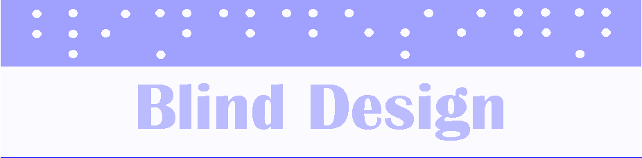
I was thinking of redesigning the type of the title, and putting braile letters in each letter to indicate the "blind design" aspect of it.
Thoughts?
Friday, October 26, 2012
Saturday, October 20, 2012
It's Good to Figure Things Out
As I was getting dressed this morning, I was thinking about all the work we have done in class this semester. We have had a number of different assignments, but I have found that I feel more comfortable with the ones that are more straight forward.
That is why I am writing this post today, because I want to fully make myself aware of my strengths, so that I will work that much harder on what I feel are weaknesses. Although I eventually want to go into magazine design, I will need to know how to design for other audiences as well.
I know this is more of an internal thought, but I would love to hear from others if they felt that they have gone through similar "ah ha" moments.
Friday, October 19, 2012
Sometimes It Takes a While to Understand
While I was at the doctors office earlier this week, I decided to read an article in a magazine. It had to do with carbs, and since I love carbs so much, I wanted to know how to keep away from the bad carbs while sticking with the good ones. Please take a look at the article below:

Not only did the bar hinder me from reading the article, I actually put the magazine down and stopped trying because the design was so poorly considered before publishing. I know that we sometimes make spreads that we just LOVE, but this is a true example of killing your babies. The chalk board idea is cute, but someone loved it a bit too much, and some editor didn't actually take the time to read through it.
Lesson learned, I will NEVER create a spread like this!
There's An App For That!
While I know very little about applications for phones and tablets, I do know that there is one that always catches my eye.
You guessed it, Temple Run!!
I don't have an iPhone, iPad, or anything i other than my 8 year old iPod, but I find myself always stealing, borrowing I should say, anyone's device that has Temple Run on it. It's addictive.
I remember being at my friends graduation from Yale and all I hear behind me is the unmistakable sound of Temple Run monkeys. Did I get mad that some little kid was ruining the graduation ceremony for me? No! I got mad that I didn't get to take a turn at the fun.
Another app that I love, which is on my phone, is Blackberry Travel.
This app takes any travel itinerary that is emailed to my phone and stores it away until I need it. It comes in handy since I travel a lot, and I don't have to write down flight confirmations, dates, times, hotel names, confirmation numbers, etc.
I will be switching to an iPhone soon, since Blackberry's will be going out of business soon, and hope that they have an app as great as my Blackberry Travel; but at least I will have Temple Run to ease the pain if they don't.
Friday, October 12, 2012
Call to Action
It's the year 2012, that means it's an election year. I receive calls to action all the time through the mail. I even got one today from a clothing company via text asking me to shop with them today. Being that it is an election year, I receive calls to action daily from the President, and many others, asking me to donate to the campaign, thus reminding me to vote.
Not only do they send these emails asking you to donate, they make it easy for those who have already donated by having a "quick donate" button. This is actually a great idea since American's have such a short attention span.
While this call to action isn't quite as appealing as the 20% off Bed, Bath and Beyond coupon I receive monthly (and leave at home each time I go. Just this week they got me for $75), it works. Please see below for an example of my daily emails.
How to Relax During a Stressful Week
While I was searching the web for pictures for another project, I stumbled across this site. It is a site full of royalty free stock photos of travel scenes. Since I love to travel, and constantly dream about the new and exciting places I will go, I always flip through the pictures of my travels when I am stressed out.
Since This week has been such a hectic one, and it is only going to go down hill from here, I enjoyed looking through these photos; and even added a few destinations to my bucket list.
Since I know that some people in our class are probably stressed out as well, I have included a site that contains pictures that are guaranteed to make you feel better. Take a look and let me know if it worked.
Live Trace is the Devil
I have been working on sprucing up my Little Black Book for this weeks class, and decided that I would try to hand write the words to give the book a more authentic feel.
After writing all my 10 pages out, I did everything I could to make live trace work for me. Unfortunately, I clearly don't know how to properly use it. While it did trace, it also did some weird things, and wouldn't let me move any of the objects I traced.
I will have to learn how to get it all done, but for now, I will stay as far away as possible!
Friday, October 5, 2012
Wicked

Last year, I had a life changing moment. I saw Wicked for the first time. I made a vow that day that I would see it whenever it came to Baltimore or DC. You could imagine how excited I was when I found out that it was coming to the Hippodrome this month. As soon as tickets went on sale I bought my tickets, in the nosebleeds, little did I know I would also be there opening night, last Wednesday.
I ended up winning a contest for two REALLY GOOD seats to opening night. I was a bit hesitant because I was going to miss the debate, but I decided to honor my vow and go!
While I was there, I couldn't help but think of something Amy said in Typography. She talked about how designers watch movies and critique the credits type choices. While walking around, I couldn't help but look at the type every where. I looked in the program, the board with the casts names, the items for sale. Not only was everything perfectly branded (as I would hope it was, or else someone was getting fired), but everything looked like it belonged. Even the map on the curtain before the show started matched.
I notice how much more I appreciate type and design now that I am learning so much about it, and refining my skills.
Do you ever find yourself critiquing posters, ads, movie credits, or anything else that people have paid a great deal of money to make sure it's perfect? I know I do all the time now.
A Few of My Favorite Words
I find that there are a number of words that I like saying, or say way too much. Please enjoy my continually growing list.
1. Inebriated
2. Absolutely
3. Hypocrite
4. Eroneous
5. Ridiculous
6. Rectify
While there are more, it takes me some time to think of them all. I find myself using these words as my go-to words when I am talking, tweeting, singing...pretty much all the time.
1. Inebriated
2. Absolutely
3. Hypocrite
4. Eroneous
5. Ridiculous
6. Rectify
While there are more, it takes me some time to think of them all. I find myself using these words as my go-to words when I am talking, tweeting, singing...pretty much all the time.
Thursday, October 4, 2012
I'm Still on the Fence
Warning: This post has political information in it. The picture is not meant to be commented on in a political way, strictly use design standards.

This year, Marylanders have a number of issues to decide on for the state, and even more to decide on county wide. One of the issues is Question 6, a bill that will extend civil marriage rights to same gender couples in the state.
This is the official logo/bumper sticker/yard sign for the campaign; and although I saw it a long time ago...and hated it, it is now growing on me.
The hierarchy in this sign is important, and spot on. The campaign wants people to know they are voting FOR 6, the two largest elements in the design.
Do you think this design works, or is it lacking something? I feel like I want something else from it, but understand the importance of simplicity.
Subscribe to:
Posts (Atom)